
Where Reading Takes You
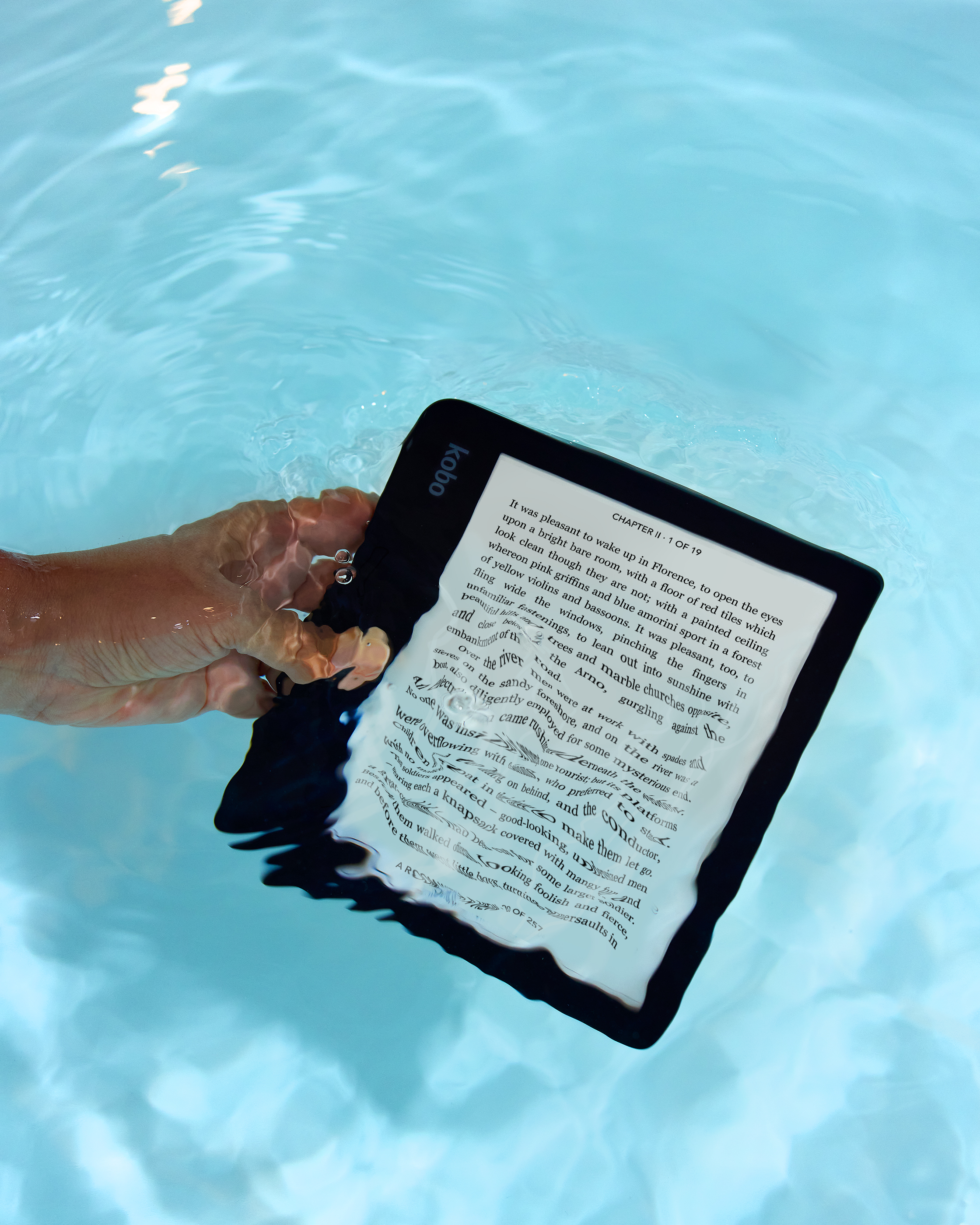
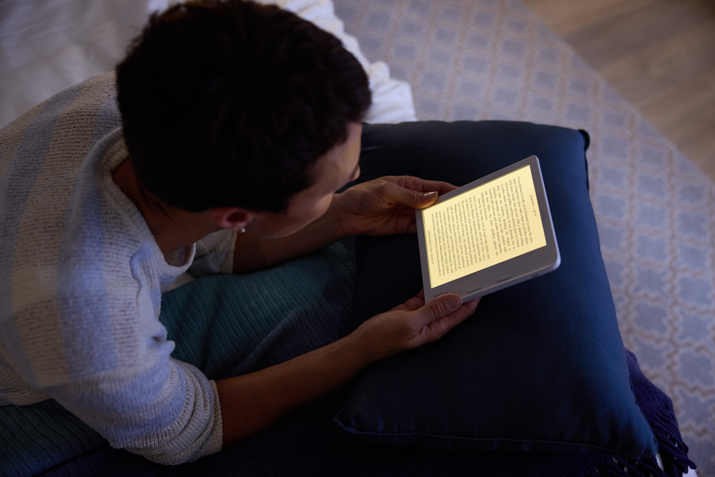
Dedicated readers are always reading. They’ll pull out their eReader at a moment’s notice — waiting for the oven to heat up, or waiting in line for a coffee, they'll probably sneak a few pages in. It’s a passion that drives readers’ desires to have their eReaders on them at all times, and to have the best eReader available and maximize the pleasure they get out of every page.
How do we speak to this ever-burning dedication and hold up Kobo Libra 2 or Kobo Sage as their perfect eReader? We created a campaign that reflects our bold readers in their natural reading habitats, both active — Kobo Libra 2 — and refined — Kobo Sage, — in the way that reading defines them.

Creative
Thinking
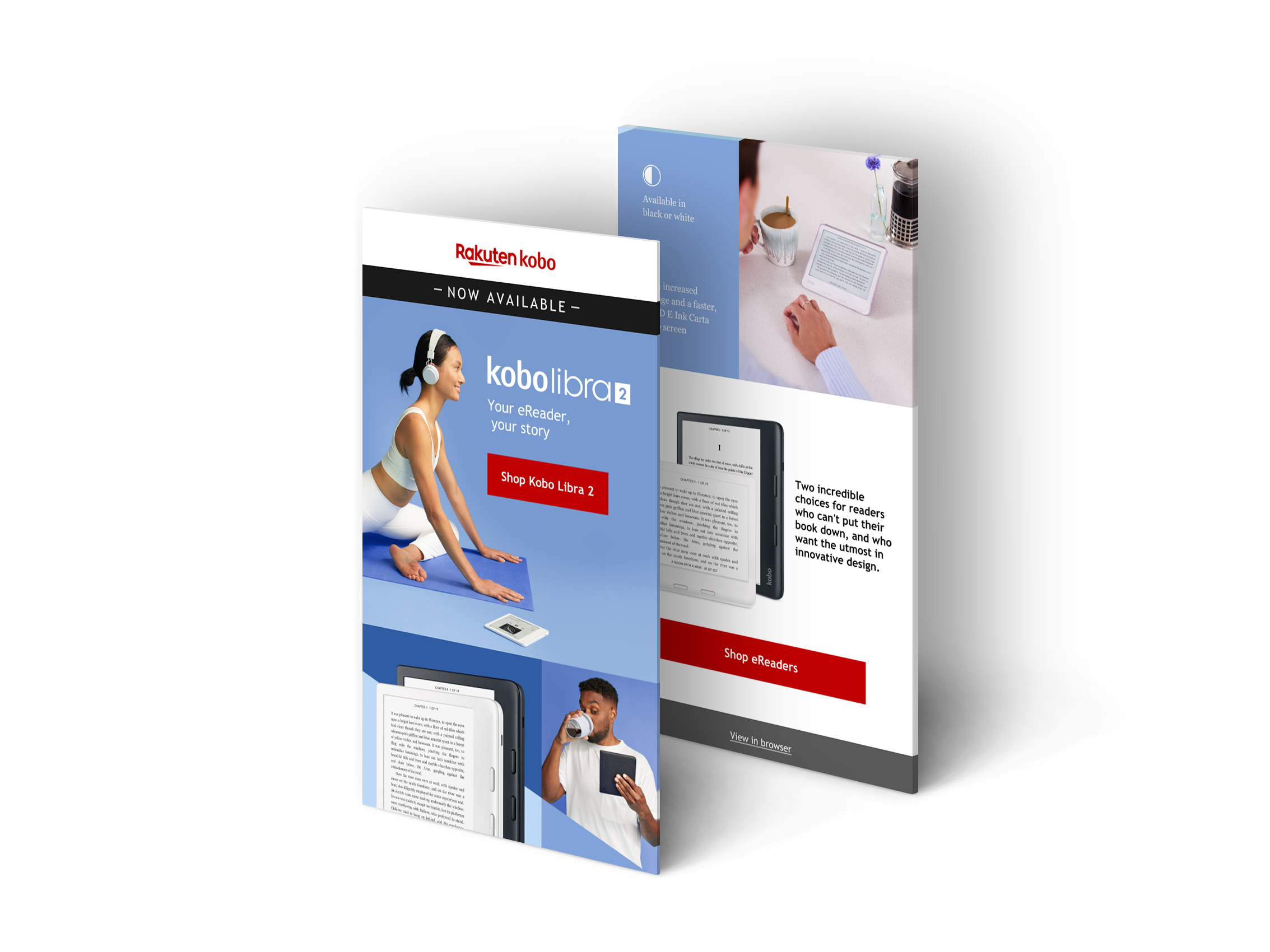
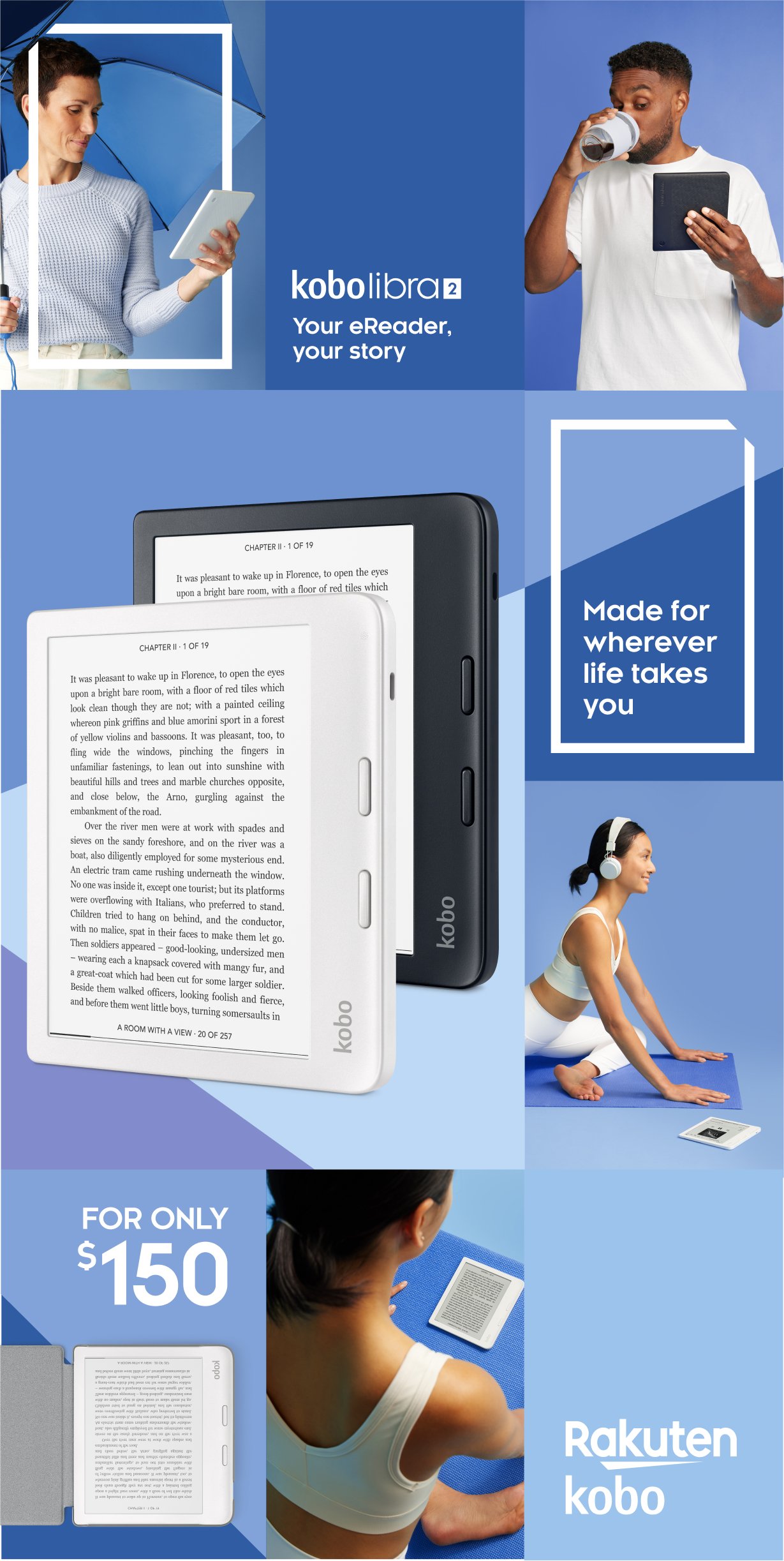
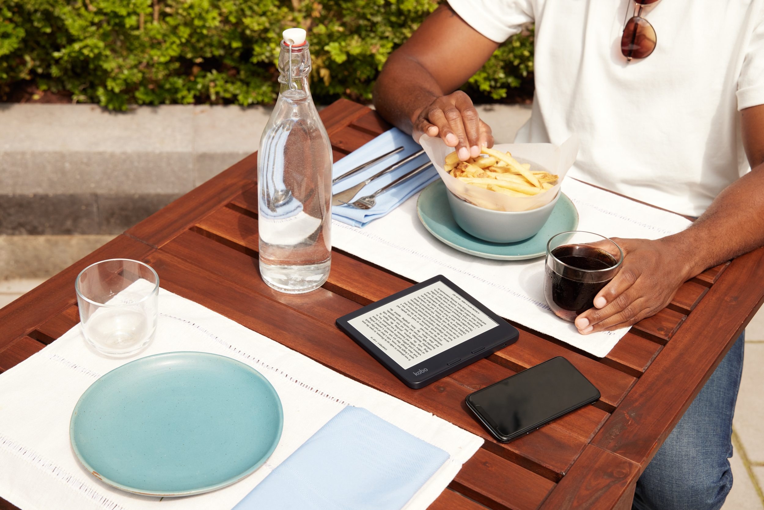
Now, we said that Kobo Libra 2 is for readers who are always on the go, always in motion. To communicate this idea, I wanted to show our readers doing what they love but also reading while doing it. For example, they would read while waiting in line to get their coffee, they read during their lunch break, or doing yoga stretches and even reading under the rain.
The colour tones you see across these assets tie back to the packaging prism colours, in fact the deep blue and pink from the packaging, when combined, create this periwinkle tone. Also, the colour blue represents both the sky and the sea, and is associated with open spaces and freedom, ideas that communicate the fact that you can literally read everywhere.
For this campaign I have reinvented Kobo’s main brand element, the prism, in a way that is dynamic and aligns to the idea of these readers always on the move. I wanted to play with the layouts, create endless patterns and even communicate every single detail of the product in one single space.
Photography





The Team
-
Lee Singleton
-
Clariana Lorelli
-
Clariana Lorelli
Triestina Schlaepfer
Anton Sanchez
Agency: Sophomore -
Nick Blagrave

