Kobo Packaging Line up
A holistic view
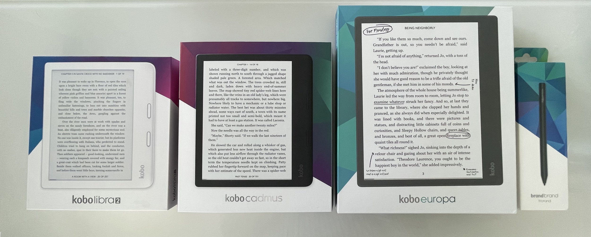
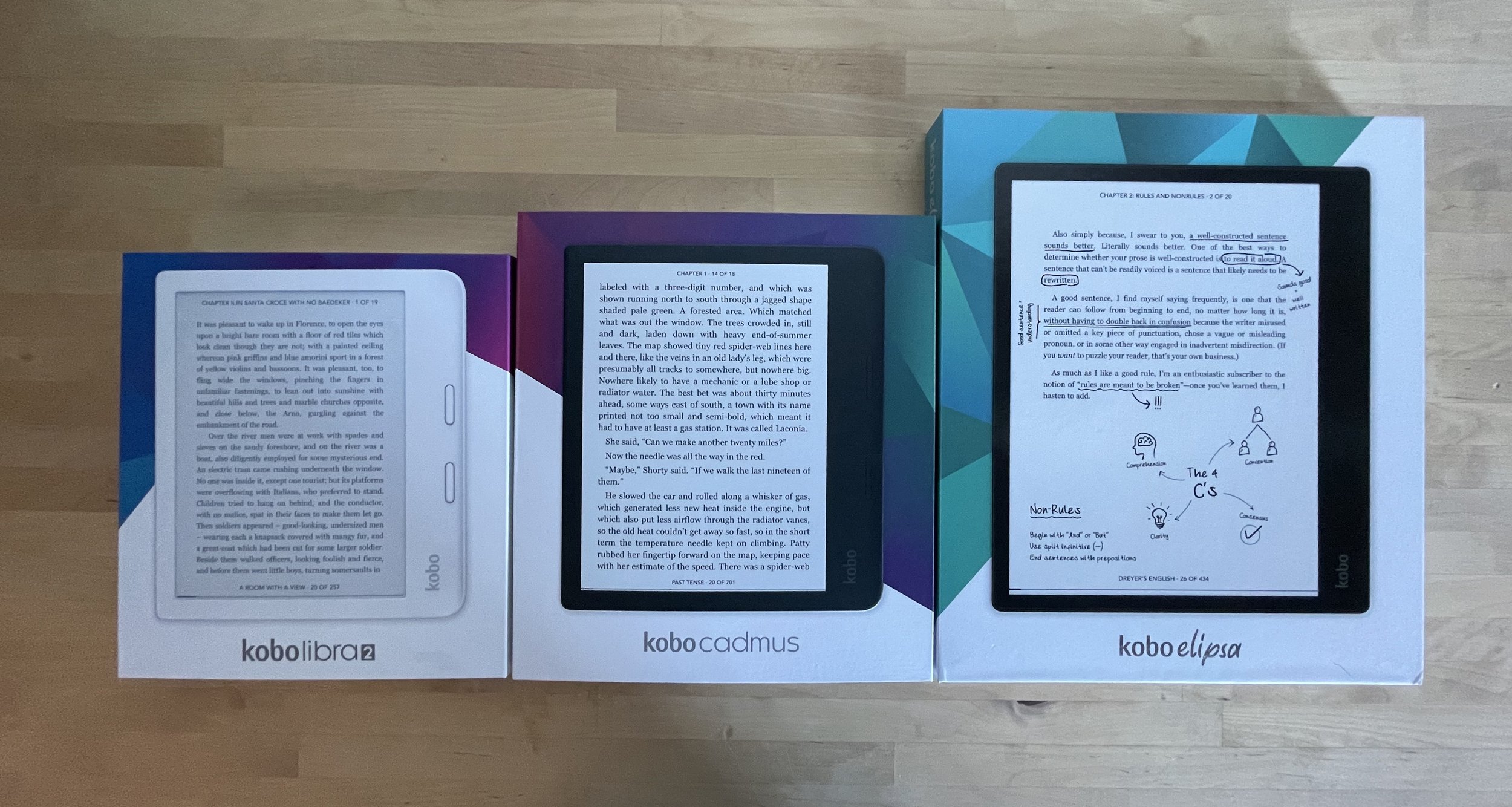
Since the moment I took the lead on designing Kobo’s future device packaging line up, and as the brand steward, I wanted to create something fun, colourful and on brand. I was challenged by the fact that each Kobo device has its own marketing positioning and personality, they all have similar features but there is usually one of them that stands out amongst all. On top of that, Kobo’s packaging family was completely disconnected, so I wanted to create a pattern that would not only facilitate the creation of future boxes but also something that had a fun twist in retail presence.
Kobo Elipsa
Starting with the launch of Kobo Elipsa, I leaned into one of Kobo’s main brand elements: The Prism. I’ve created unity among their package designs by consistently leveraging the prism and aligning each package colour with supporting communications.


Kobo Libra 2
Kobo Libra 2 is the new and improved Kobo Libra H2O, the perfect balance between reading comfort and beautiful design, but also, Libra is the sign that strives for balance between polarities. Knowing that Kobo Libra 2 was taking the place of Kobo Libra H2O, I saw it as the connection between Kobo’s entry level device “Kobo Nia” and our luxe device.
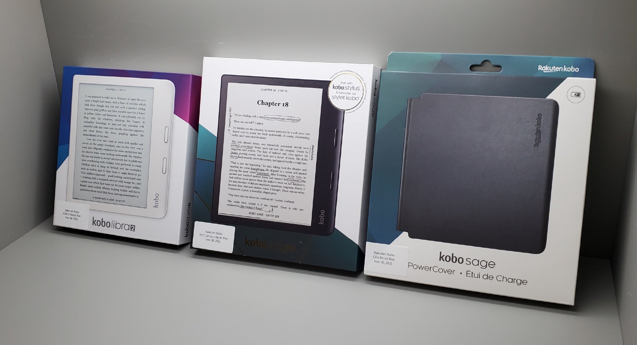
Kobo Sage
Kobo Sage is a must-have for methodical readers who seek luxury in every aspect of their life. I thought of Kobo Sage as the royalty of eReaders, because simply you get the best in class features that Kobo has to offer in one device. I leveraged the rich jewel tones in the deep purple and vibrant teal fractals of the prism to represent the luxury of Kobo’s most high-end device.


Initial Concept Stage
The Team
-
Clariana Lorelli
-
Lee Singleton
-
Christine Ampagoumian
-
Lindsay Gray
-
Anna Buechin


